


Renowned Artist Vasilis Marmatakis Breathes Innovation into "Poor Things" Poster


Embark on a journey behind the scenes of the film industry, where the first glimpse of a movie often comes from its poster, capturing our attention before the trailer. Greek graphic designer and illustrator Vasilis Marmatakis presents a striking poster that breathes new life into the Frankenstein legend for the upcoming film 'Poor Things.' Delve into the details below to explore this innovative creation.
Behind the creative poster of "Poor Things," which has garnered 11 Oscar nominations, is the Greek graphic designer and illustrator Vasilis Marmatakis.
Marmatakis states, 'The film poster is usually the first thing you see, so it should create an expectation to watch the movie.' This film, providing a feminist perspective on the Frankenstein legend, has received 11 Oscar nominations, including Best Picture.
Known for his bold use of impressionistic typography and fantastic, peculiar arms that subtly guide you into the right mindset for the film, Marmatakis faces the challenge of attracting viewers based on the look, feel, and the people involved, amidst the age of social media and star contracts.
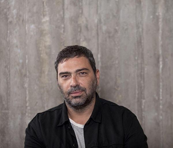
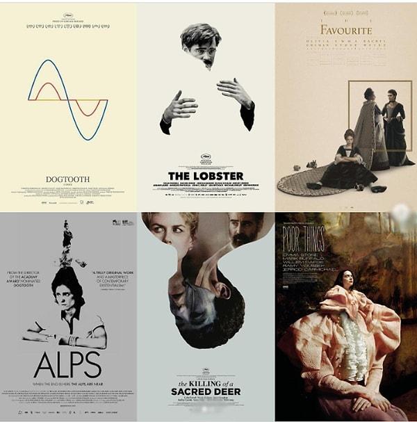
After studying graphic design at Camberwell College of Arts and the Royal College of Art in London in the 1990s, Marmatakis started working in an advertising agency, where he met director Yorgos Lanthimos. Their first collaboration was for Lanthimos's breakthrough film, 'Dogtooth,' in 2005, establishing Marmatakis as the creative force behind the film's intriguing poster art. In an interview with The Credits, Marmatakis discusses his approach to the Poor Things poster.
Was there any specific guidance given for the Poor Things poster?
'I didn't receive any direction from Yorgos; this is interesting to see. This applies to all the posters I've designed for his films. There's more or less the same process for everything we've worked on together. I usually get the script very early, and if possible, I visit the set to get an idea of how the film will look. For Poor Things, which visually is different from the other films I've worked on for him, I then get all the set photographs. For Poor Things, there were around 2,000 images. Everything is sent; it's not a selection because I might need a specific item, like a hand or an eye or a tree. It's very helpful to gather all this information before starting to work on a film.'
Where do you usually start?
'Sometimes, the film's chapter headings come before the posters. I have to be very careful about which typography to use because it probably hasn't been designed yet but will feature on the poster. For Poor Things, there were hyper-realistic black-and-white sequences between chapters. So, I had to create a very thin, long, almost exaggeratedly tall font to complete and make visible the background elements. This font became the first typographic identity for the film, later refined using a combination of three handwritten fonts.'
What were they shooting on the day you visited the set?
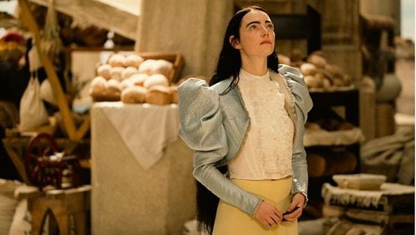
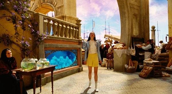
'On the day I visited the set, they were shooting the scene where Willem Dafoe's character, Godwin Baxter, retrieves Emma Stone's character, Bella Baxter, from the water. She's dead and lying on the operating table, and he's about to operate on her. The other scene was Mark Ruffalo's character, Duncan Wedderburn, in a small mental hospital room. Meanwhile, I had the chance to wander around other parts of the set, including the London house, which was absolutely stunning.'
Where do you prefer to work?
'I work in my studio. I isolate myself a bit, and after two or three months, this changes. I tell Yorgos I'm ready, and we meet to go over the suggestions. I always present very mature designs - not in the progress stage. Also, I usually try not to present them digitally or send them by mail. I print the posters, usually 70x100 cm. I'm really old school about this. I love the feel and texture of the paper. Production values matter. For example, two of the proposals for these posters were printed on reflective paper like a mirror. The typography and images really looked as if they were screen-printed. I designed about 12 different posters for Poor Things. Yorgos suggested some minor changes in maybe one or two of them, and then these were presented to the producers.'
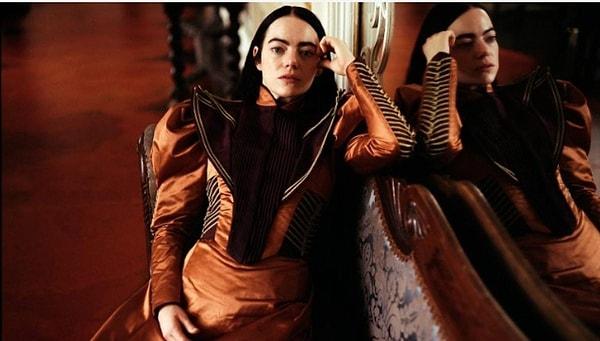
Let's talk about the poster showing waves of emotions flowing from Emma Stone's open chest.
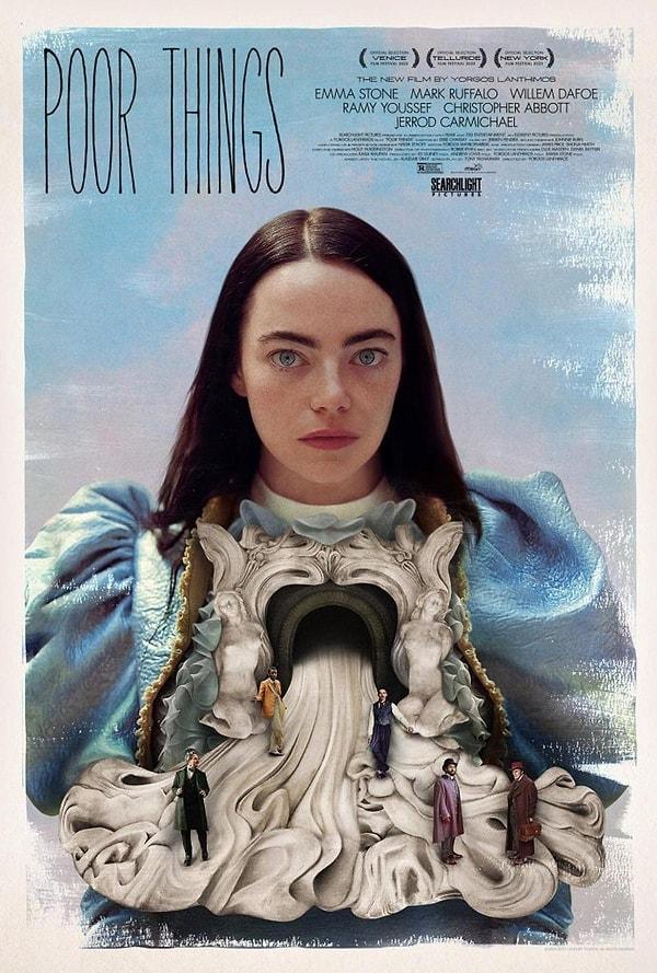
'Searchlight Pictures had a poster proposal that portrayed male characters as well. They already worked on Bella's upper body image. So, I used their top part and designed the background with these hand-painted brushstrokes, and then arranged everything to be below: the spilling organs and five male characters trying to balance in this chaotic texture, representing all her unfiltered emotions flowing from within, creating a new environment for men to adapt.'
How did you manage to create this surreal makeup effect?
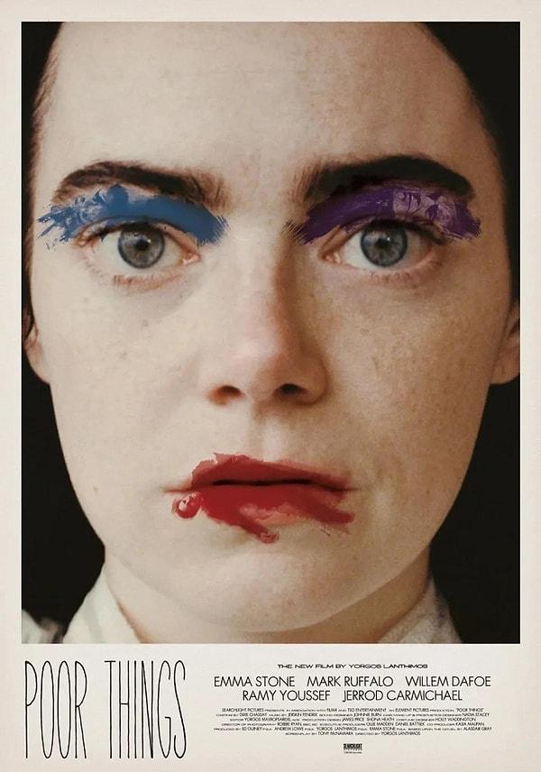
'Yes, these images were hand-painted. I made hundreds of brushstrokes, and then found the right figures for each actor to fit those strokes. For example, for Mark Ruffalo (as a lipstick stain), this 'broken' effect is actually composed of four different body parts taken from different photos. Then, I digitally overlaid them onto the brushstrokes.'
Observing your intention to leave some mystery when designing the poster for 'The Favourite,'" can you elaborate?
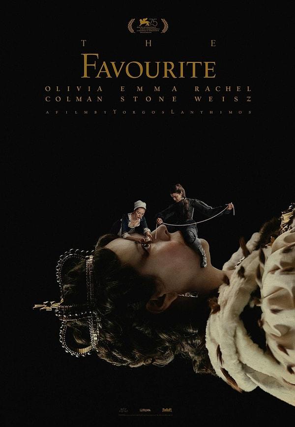
'Regarding 'The Favourite,' the idea was to use the profiled image of the queen (Olivia Colman), a classic image you see on a stamp, but here with two extra figures (her lovers) manipulating her. You don't know if they are killing her, decorating her, or torturing her. You can't understand. Emma Stone is holding a brush and about to hit the queen's eye, and Rachel Weisz is sitting on her lips, blocking the queen's breath. She's also holding a row of pearls, seemingly adorning her.
Keşfet ile ziyaret ettiğin tüm kategorileri tek akışta gör!
 Test
Test
 Gündem
 Magazin
 Video
Video


Send Comment