


Side-by-Side Photos of Instagram vs Real Life Autumn Views Stun Viewers


The transformation of leaves in autumn begins as the days shorten and chlorophyll production slows down. As the green pigment decreases, yellow and orange hues become prominent, while accumulated anthocyanin paints the trees a vibrant red. With the arrival of September and October, social media feeds start to overflow with the most saturated tones of yellow, orange, and crimson. Roads covered with fallen leaves, foggy mountain bends, and wooden cabins seem as if they have sprung from a fairytale. Each of us loves to romanticize this period to the fullest.
On social media, the real and portrayed images of autumn were shared. Scenes of a lakeside road, a leaf-covered railway, and train views were first presented with filters, then in their true form. Even though the colors faded, it was evident that the landscapes and the beauty of autumn didn't lose any of their charm.

You can watch it from here;
So, how can we create such impressive autumn visuals?
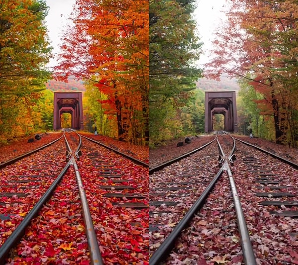
Content creators are eliminating green tones entirely and maximizing the saturation of orange and red hues in their photos and videos, thanks to the HSL (Hue, Saturation, Luminance) settings they apply. However, in the real world, autumn presents itself with the dull brown of dried leaves, the yet-to-fade green shades, the grey light brought by overcast skies, and muddy grounds. To achieve such photos, you can make the following adjustments:
Hue: Green and yellow tones are shifted entirely towards orange and red. You bring green closer to yellow, yellow to orange, and orange closer to red.
Saturation: The saturation of red, orange, and yellow colors is drastically increased. The saturation of other colors like blue and green is sometimes reduced to make the warm tones pop.
Luminance: The light of red and orange tones is slightly decreased to make the colors appear darker, richer, and 'liver-like' red.
White Balance (Temp): The overall white balance of the photo is pulled towards the 'warm' (amber/yellow) side.
Vibrance & Saturation: These values are increased to enhance the overall color intensity.
Contrast and Dehaze: The contrast is increased to accentuate the gap between colors. The 'Dehaze' setting is increased to cut through foggy or hazy weather (this also darkens and brightens the colors).
Masking (Painting with a Brush): Only the areas where trees or leaves are located are selected (masked) and the redness and warmth of those areas are independently increased (to keep the sky or the road natural).
Shoot in RAW Format: Turn on the 'RAW' (raw) shooting feature on your phone or camera. RAW photos record much more color data, so you can pop the colors as much as you want without fading or distorting them during editing.
Use a Polarizing Filter (CPL): Polarizing filters, which are attached to the front of the lens, cut off light reflected from leaves and water, allowing natural colors (especially autumn leaves) to appear much more saturated and non-glare.
Keşfet ile ziyaret ettiğin tüm kategorileri tek akışta gör!
 Test
Test
 Gündem
 Magazin
 Video
Video



Send Comment